Extinction
Melanie Olson
February 2 – 25, 2022
Artist Statement
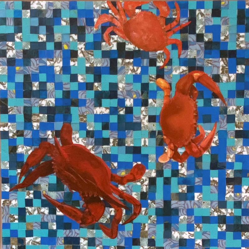
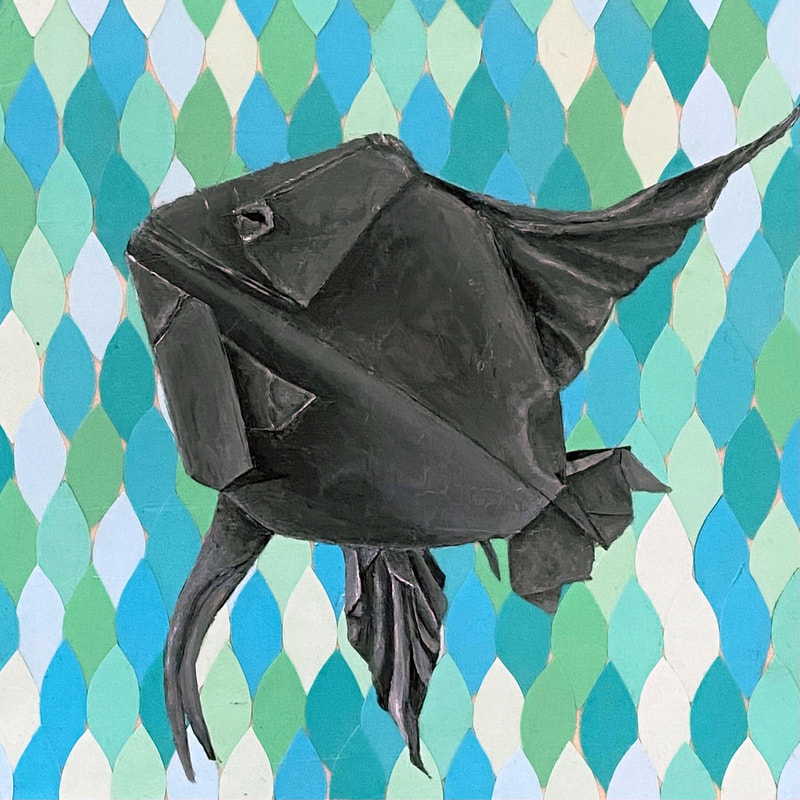
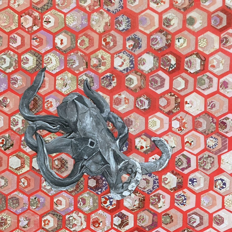
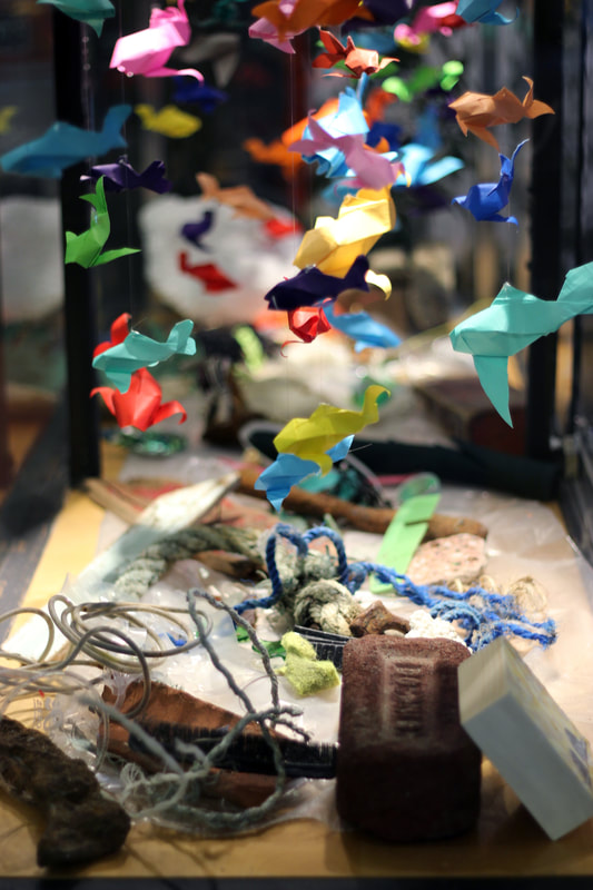
This work uses the subtleness of geometric shapes aligned into repeating patterns interrupted by a superimposed image of a sea creature to force the viewer to consider what happened, why it happened and how it affects all of the elements. The viewer is reminded that our nature is being interrupted and destroyed. To remind the viewer how easily one can be distracted by beauty and fail to see the truth. The truth being the continued destruction and pollution of the forest and oceans around the world.
Trees become colourful papers. Interesting lines of the papers force the acknowledgement that all trees cut down are leading to soil erosion, reduced air quality and homes for wildlife. The pollution of the ocean continues and most not be forgotten. More species come to extinction daily and soon the once vibrant oceans will be colourless save for the garbage.
Living in Vancouver has taught me that every living thing is connected in some way, whether we can see the connection or not. If the land is destroyed, that leads to further pollution of the oceans. In addition to being aware, what more can we do to stop this destruction?
This work draws influence from Islamic Geometric Patterns. Their preservation on buildings in the ancient world amaze not only with the exact preciseness but also with the vivid colours of tiles. It is also inspired from quilters throughout time. This work also draws from Leonardo Da Vinci who had a keen eye for observing what can be seen and not fearing to question what he saw, to dig a little deeper and see the unseen parts as well.
All pieces start from a decision on a pattern that is to be created. From there, paper colours are chosen and the cutting and gluing begin! The paper pattern is coated in several layers of various acrylic mediums to preserve the paper from oil paint used to paint the sea creature. One of the exciting parts of the process is the addition of the acrylic mediums. Too thick a layer and you lose the pattern texture below. Too thick a layer and the acrylic medium starts to look cloudy and you lose some of the details in the pattern.
Melanie Olson CV

Click on image to see full piece. All images © Melanie Olson
See the price list for Melanie Olson's exhibition here.
|
|
|
The Darkest Place
Patrick Meighan
February 2 – 25, 2022
Artist Statement
I have been exploring this line of inquiry for about 5 years. I have always struggled with the “why” in my art practice, for some reason the answer seems obvious now: because I have to.
It all started with fabric. I love curtains, drapery, something about it. I like it aesthetically and also in theory: a curtain, in its nature, is an object made specifically to obscure a person's view, therefore by being present it renders something else invisible. In A Lover’s Discourse Roland Barthes quotes a Japanese proverb:
Sometimes the darkest place is underneath the candle
This reality reminded me of some familiar theoretical interests in my art practice, that I always attempted to blur the lines between representation and abstraction as a means to explain reality and its misgivings. Language itself seems to me to function in this way, it ruins everything by being necessary.
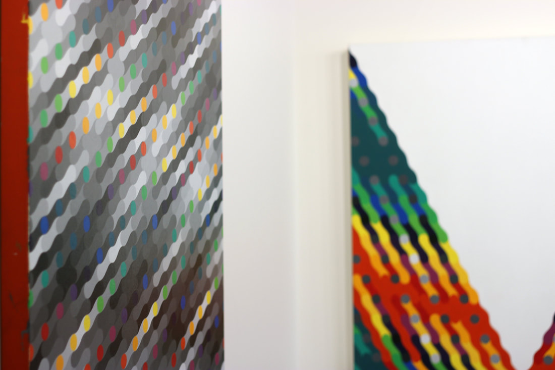
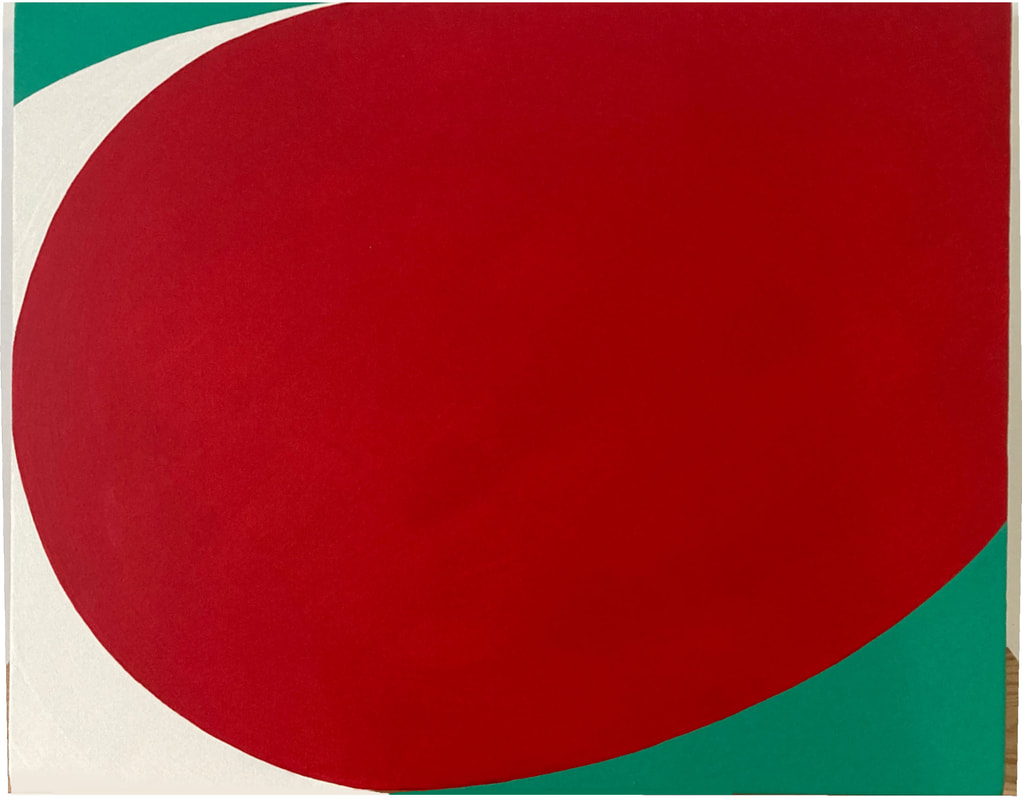
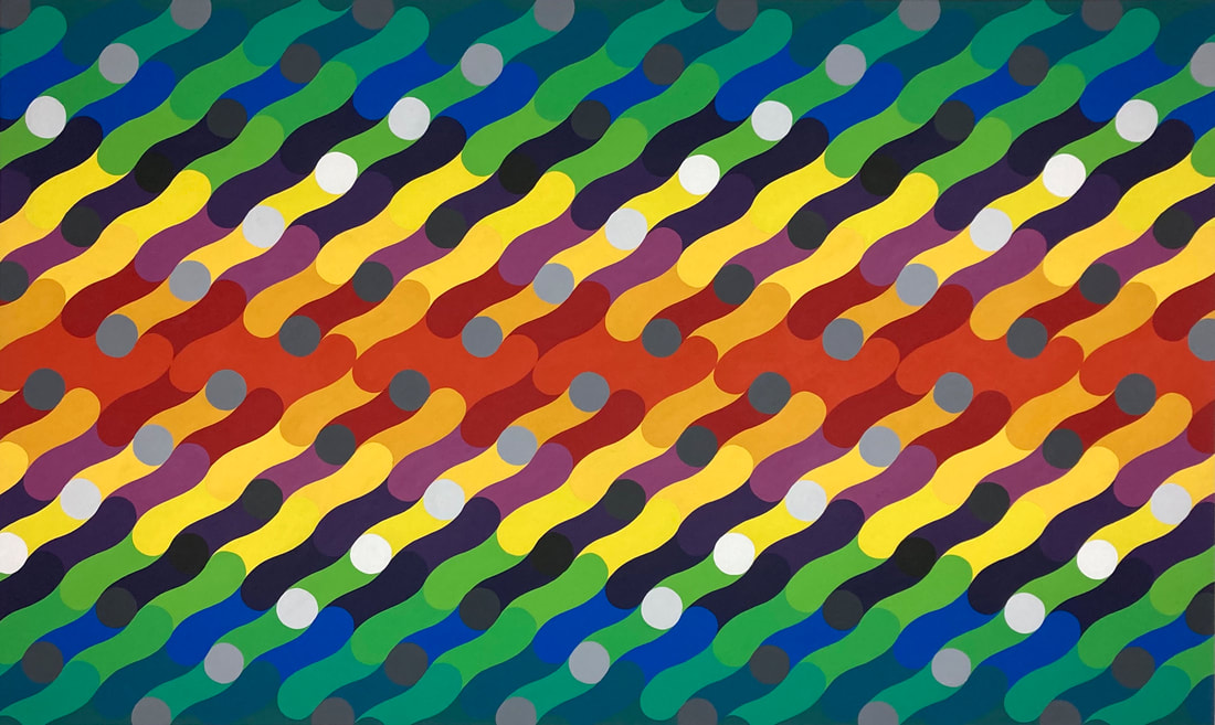
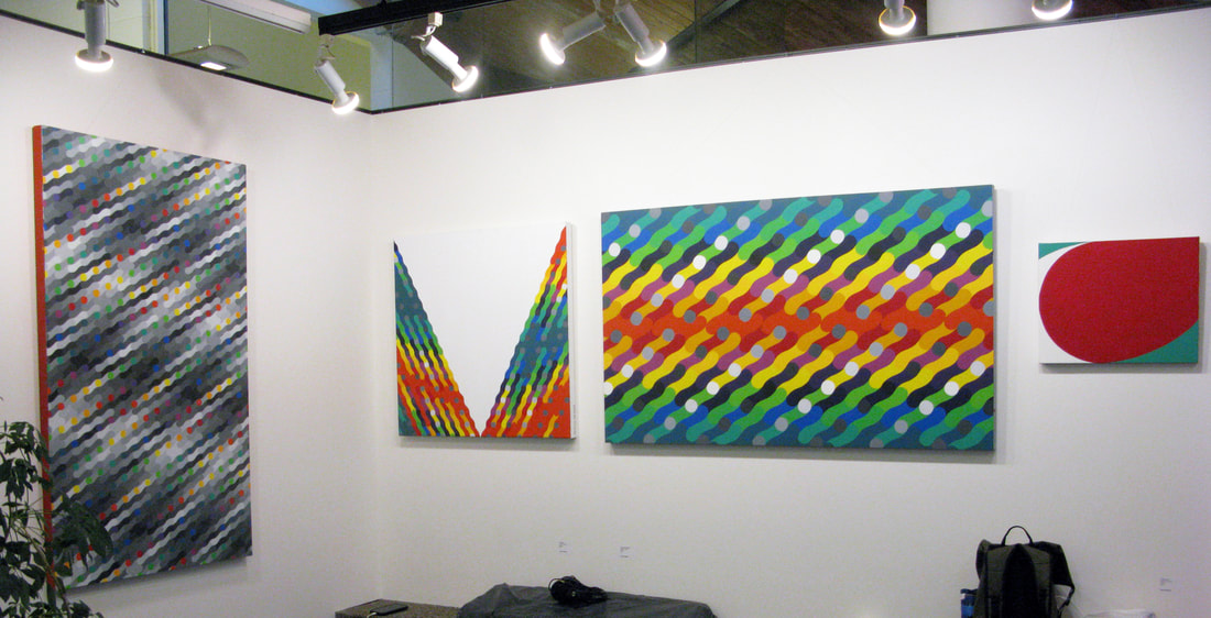
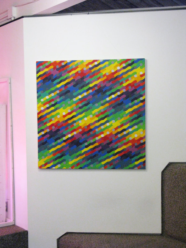
I began drawing curtains, their pleats, lines falling from top to bottom and a fold back and forth and back and forth coming all the way down to the floor as the pleats translated themselves from a rigid and concise beginning to a loose and uncertain end. I started to focus on the shape the fabric made at its lowest point, between the fabric and the floor, and it digressed into a pattern which, over time increased in repetition until eventually a system emerged. My use of colour had been growing and I had been taking my lead in this respect from Argentinian Op Artist Julio Le Parc and Danish designer Verner Panton, both at their height in the 1960’s. My work took on a design quality at this point and it wasn’t until I was reminded of the British Op Artist Bridget Riley that I began to consider the canvas, it’s shape and size and my work in relation to it. At this point I realized what I might be attempting to do, that is to make something simultaneously visible and invisible therefore expressing my impression of reality as it appears through the window of language. Of course, I wanted to recreate the idea of a curtain. Other themes apparent in my work are the discombobulation created by media, and the interconnection of everything, to name a few.
Painting these things is often heavily ideas based, leading to a painstakingly uncreative painting process. Working in a hard edge style with highly pigmented acrylic house paints, hand brushing without the use of tape, attempting to make every line, every circle as perfect as I can without sacrificing too much time or happiness. The act of painting can be therapeutic and satisfying at best, monotonous, physically demanding and depressing at worst.
Bio
Patrick Meighan (born 1984 Whitehaven, UK) is a visual artist living on the ancestral lands of the Musqueam, Tsleil-Waututh and Squamish people, currently painting with acrylic and gouache and working with fabric sculpture. Patrick's current practice reflects a love of colour, form, patterns and systems which he has created and continues to explore. Working from an initial appreciation of drapery and the shapes made when pleating fabric, Patrick has developed a style which has moved away from representation and into abstraction.
Patrick Meighan CV.
I have been exploring this line of inquiry for about 5 years. I have always struggled with the “why” in my art practice, for some reason the answer seems obvious now: because I have to.
It all started with fabric. I love curtains, drapery, something about it. I like it aesthetically and also in theory: a curtain, in its nature, is an object made specifically to obscure a person's view, therefore by being present it renders something else invisible. In A Lover’s Discourse Roland Barthes quotes a Japanese proverb:
Sometimes the darkest place is underneath the candle
This reality reminded me of some familiar theoretical interests in my art practice, that I always attempted to blur the lines between representation and abstraction as a means to explain reality and its misgivings. Language itself seems to me to function in this way, it ruins everything by being necessary.
I began drawing curtains, their pleats, lines falling from top to bottom and a fold back and forth and back and forth coming all the way down to the floor as the pleats translated themselves from a rigid and concise beginning to a loose and uncertain end. I started to focus on the shape the fabric made at its lowest point, between the fabric and the floor, and it digressed into a pattern which, over time increased in repetition until eventually a system emerged. My use of colour had been growing and I had been taking my lead in this respect from Argentinian Op Artist Julio Le Parc and Danish designer Verner Panton, both at their height in the 1960’s. My work took on a design quality at this point and it wasn’t until I was reminded of the British Op Artist Bridget Riley that I began to consider the canvas, it’s shape and size and my work in relation to it. At this point I realized what I might be attempting to do, that is to make something simultaneously visible and invisible therefore expressing my impression of reality as it appears through the window of language. Of course, I wanted to recreate the idea of a curtain. Other themes apparent in my work are the discombobulation created by media, and the interconnection of everything, to name a few.
Painting these things is often heavily ideas based, leading to a painstakingly uncreative painting process. Working in a hard edge style with highly pigmented acrylic house paints, hand brushing without the use of tape, attempting to make every line, every circle as perfect as I can without sacrificing too much time or happiness. The act of painting can be therapeutic and satisfying at best, monotonous, physically demanding and depressing at worst.
Bio
Patrick Meighan (born 1984 Whitehaven, UK) is a visual artist living on the ancestral lands of the Musqueam, Tsleil-Waututh and Squamish people, currently painting with acrylic and gouache and working with fabric sculpture. Patrick's current practice reflects a love of colour, form, patterns and systems which he has created and continues to explore. Working from an initial appreciation of drapery and the shapes made when pleating fabric, Patrick has developed a style which has moved away from representation and into abstraction.
Patrick Meighan CV.

Click on image to see full piece. All images © Patrick Meighan
See the price list for Patrick Meighan's exhibition here.
|
|
|
